LogoWatch Today Toshiba Memory Holdings officially rebrands as KIOXIA and has unveiled the new logo.

It’s… grey.
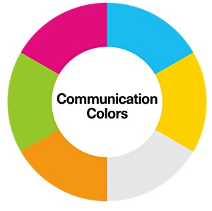
What do the marketing folks say? “The silver of Kioxia’s new logo will be the company’s official corporate colour, meant to represent the superior quality of its memory technology. In addition to silver, the company will have communication colours including, light blue, magenta, light green, orange, yellow, white and black.”
Kioxia is pronounced ‘KeeOxchia’ and should be printed in all-caps.

Naohisa Sano, Kioxia’s chief marketing officer, said: “Our full brand colour palette of bright, vibrant colors represents KIOXIA’s fun, future-driven culture, and passion for using memory to create new experiences and a colourful future for the world. Our new corporate logo and brand identity better reflect KIOXIA’s mission and vision to uplift the world with memory, using technological innovation to create new value for society.”
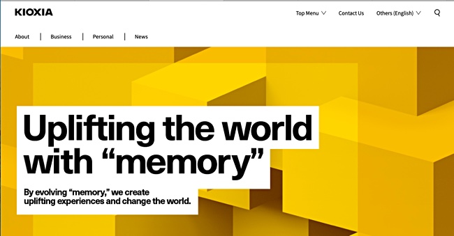
Kioxia’s logo is black on its website.

Consumer retail products such as solid state drives, SD cards and USB flash memory, will be released under the Toshiba Memory brand name until the end of the year. Kioxia kicks in in January 2020.


